What does the first website for a SaaS startup need?
What a software startup's first website needs before launch, what can wait, and what payment providers check before you can charge.
TL;DR
A SaaS startup's first website needs less than the templates suggest: a page that says what the product does and who it is for, one button that matches how you sell, a price, and the pages your payment provider checks before it lets you charge. That means terms, a refund policy, a privacy policy and a way to reach you.
Last updated 23 October 2026. Written by Oyekola Obajuwon, founder of Growveloper, a growth studio that builds the website, the marketing and the follow up for owner run businesses and software startups in the United States, the United Kingdom and Nigeria.
A SaaS startup's first website needs less than the templates suggest: a page that says what the product does and who it is for, one button that matches how you sell, a price, and the pages your payment provider checks before it lets you charge. That means terms, a refund policy, a privacy policy and a way to reach you.
SaaS, software as a service, is software people pay for by subscription and use in a browser or an app. Search for what its first website needs and most answers come from template shops and design studios. They list what a grown software company has: feature pages, integrations, comparison pages, a changelog, a roadmap, a blog. It is a list of things to build before you have anyone to build them for.
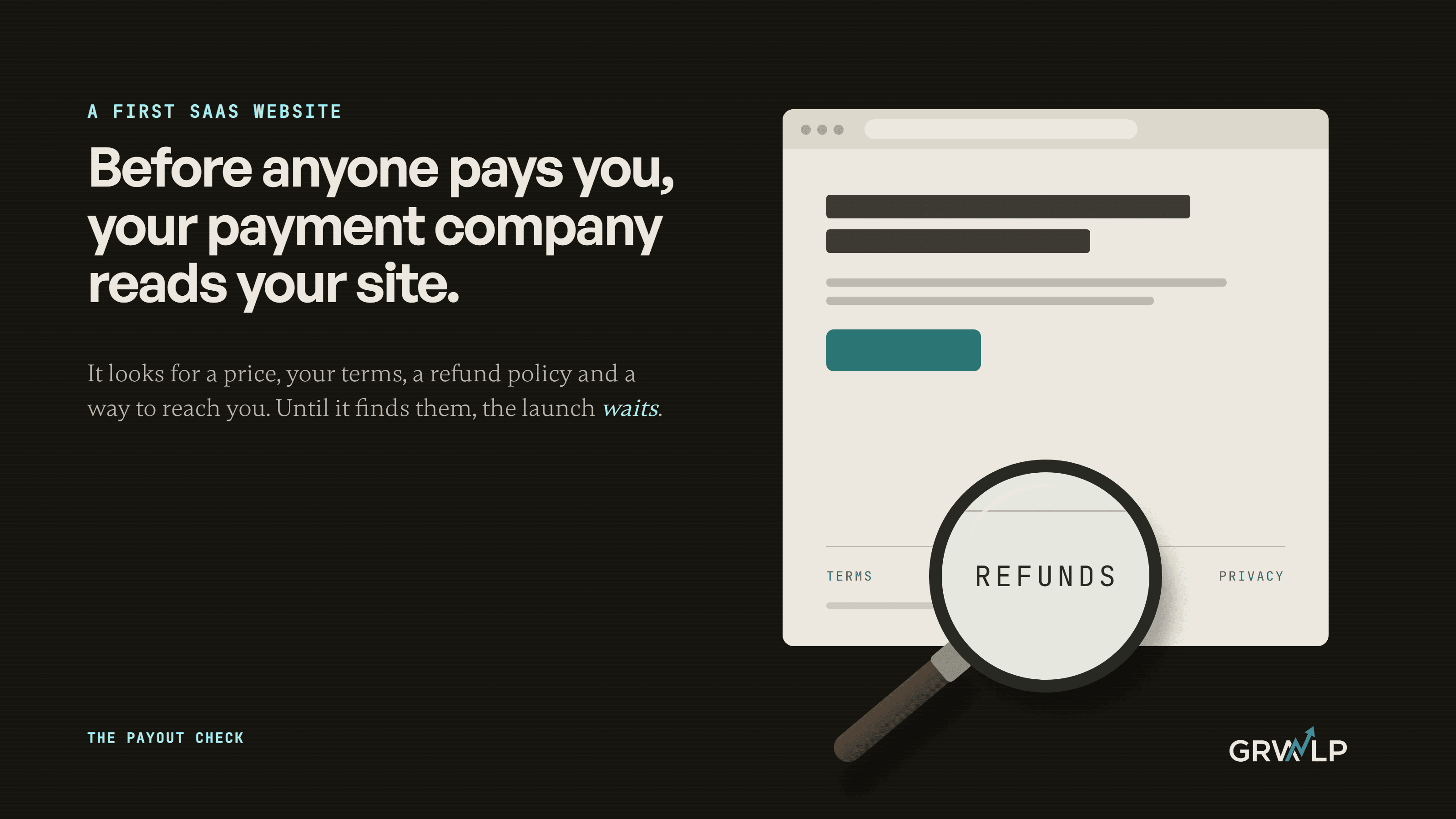
They also leave out the first reader your site will have. Before a single customer pays you, your payment provider reads your website, and it has a checklist. We call that the payout check, and it is the one part of the first site you cannot skip.
What does a SaaS startup's first website have to do?
One job: get the right visitor to take the one step that starts a relationship with you. Everything else on the page either helps that step or competes with it.
Which step depends on how you sell. If someone can sign up and get value on their own, the step is a free trial or a sign up. If a person has to set the product up with the customer, the step is a call with the founder. If the product is not ready, the step is a waiting list. Pick one.
Y Combinator's October 2023 Design Review, with Pete Koomen, a co-founder of Optimizely, opens its list with exactly this: give the visitor one clear call to action and avoid anything that competes for their attention. The same episode warns that product demos can sometimes make things more confusing, not less.
The first site has a second job that nobody writes down. It is where you learn which words make a stranger understand you. Its numbers will be small, and a borrowed benchmark will tell you little about them, which is why a good conversion rate is a question for later. For now the site should be small enough for a founder to rewrite on a Tuesday afternoon.
What pages does a first SaaS website need?
Five or six, and most of them are short.
What the first site needs at each stage
| Stage | The one step | What the site needs |
|---|---|---|
| Before launch | Join the waiting list | One page: what it does, who it is for, the form, a privacy policy |
| First paying customers | Start a trial, or buy | Home, pricing, terms, refund policy, privacy policy, contact |
| Selling to teams through a call | Book a call with the founder | The same pages, with the call as the one step |
The homepage carries the weight. In the first screen it should answer three questions in your customer's words: what is this, is it for me, and what do I do next. The pricing page can be one price and what it includes. The legal pages are plain text, and they matter more than they look.
What it does not need yet: a blog, a changelog, an integrations directory, comparison pages against bigger rivals, or a custom build. Each of those earns its place once customers are telling you what they compared you with and which tools they need you to work with. Before that, every one of them is a guess, and a guessed page is one more page to keep current.
What does your payment provider check before you can take money?
This is the payout check. Payment companies have the card networks' rules to meet, and your website is part of meeting them, so they read it before they switch payments on. Better still, they publish what they look for.
Paddle is a payment company built for software sellers. It acts as the merchant of record and handles sales tax, and it reviews every domain you want to sell from. Its help page asks for a clear description of the product, pricing details or a pricing page, the key features included, and terms and conditions, a refund policy and a privacy policy, "clearly accessible via navigation on your website". It wants your company name in the terms and the site live on HTTPS, the secure version of a web address.
Stripe's website checklist covers the same ground and adds two details worth copying exactly. Show the currency, not just the symbol. And give people a way to reach you that is not only a contact form: an email address, a phone number or live chat.
What the payout check looks for
| What they look for | Paddle | Stripe |
|---|---|---|
| What the product does | A clear description and key features | A detailed description of what you sell |
| Prices | A pricing page, or a screenshot if not ready | Prices with the currency spelled out |
| Terms, refunds, privacy | All three, in the site's menu | Refund and cancellation policies, privacy policy |
| A way to reach you | Not on its list | Email, phone or chat, not only a form |
| Free trial terms | Not on its list | Shown where the customer agrees to them |
| A secure site | Live on HTTPS | HTTPS, above all on the payment form |
Fail it and nothing dramatic happens. You just cannot take money yet. Paddle says it approves most domains automatically, and that a manual review is typically completed within an estimated five to seven business days, longer if they ask you for more. That is a long wait with the launch post already written.
Stripe also publishes its own shop terms under a Creative Commons licence and says "feel free to use the Stripe Shop Terms as a starting point as you build your site". Starting point is the right phrase. Change them to fit what you actually sell.
In Nigeria, Paystack's activation guide asks for the link to your business website and accepts links to your social media pages as well, so the form asks far less of the site itself. The data law does not.
Do you need a privacy policy before you collect a single email?
In the UK and in Nigeria, yes. A waiting list collects personal data, and the law attaches to the form, not to the launch.
In the UK, the data regulator, the Information Commissioner's Office, says Articles 13 and 14 of the UK GDPR (the UK General Data Protection Regulation) set the minimum information you have to give people, which it calls privacy information.
Nigeria's Data Protection Act 2023 is blunter. Section 27 opens: "Before a data controller collects personal data directly from a data subject, the data controller shall inform the data subject". The data controller is the business deciding what happens to the data, which here is you. The section then lists what you owe them: who you are and how to reach you, why you are collecting the data and on what lawful basis, who receives it, how long you keep it, their rights, and their right to complain to the Commission. Then it says where all of that goes: "The information referred to in subsection (1) shall be contained in a privacy policy".
So the waiting list page that most guides call the simplest possible site is already a page with a legal duty attached. If you sell from the United States, the payout check asks for a privacy policy anyway: Paddle lists it and so does Stripe. The fix is small either way. One plain page that answers those questions, linked beside the form.
Should the main button say sign up, join the waiting list or book a demo?
Whichever matches how a customer actually starts. The mistake is offering all three at the same size.
When we rebuilt VIP Creative Studio's website, its whole web presence was a single Wix landing page. VIP was not a software company. It was a fractional marketing agency selling to credit union marketing leaders, buyers the case study calls risk-averse, who want a conversation before they say yes. So the site was built as a funnel with one exit. The homepage built trust. A partnership page explained how they worked. Service pages went deep. Success stories gave the proof. In the case study's words, "Every page pushes toward one action: Book a Discovery Call."
That is the shape for a software company that sells through a call. If your product sells itself, the one action is the sign up, and the call becomes a small link for the teams who want one. Either way, a visitor should never stand in front of three buttons of the same size and have to work out which one is meant for them.
What can wait until after launch?
Most of what the templates list. A blog can wait until you know the questions your buyers type. Comparison pages can wait until customers tell you who they compared you with. An integrations page can wait until people ask for integrations.
A custom build can wait too, and we say that as a studio that builds them. We build software company sites on Next.js and Sanity, and our own software company page is plain about when that is worth it: "Below $500K ARR, founder-led marketing usually outperforms agency engagement." ARR is annual recurring revenue. A first site made from a good template and written by the founder beats an expensive site written by someone who has never spoken to a customer. When the site has to load very fast, rank across many pages or be edited by a team, that is when a framework like Next.js earns its cost, and the kind of build our web development work is for.
What cannot wait is the part nobody screenshots for a launch post: the price, the policies, a real way to reach you, and the domain, the hosting and the logins in your own name. Who owns a website a developer built covers that last one.
If you want a second pair of eyes on yours before you submit it for review, book a free call.
The first site is small on purpose. It has one button, one price and three plain pages a payment company can find in the menu. Everything else is something your customers will tell you to build.
“Before a single customer pays you, your payment provider reads your website, and it has a checklist.”
Written by Oyekola Obajuwon
SaaS website · first website · software startup · startup landing page · pricing page · privacy policy · refund policy · Paddle · Stripe · waiting list page